The United States elects its president not directly by popular vote but by an Electoral College composed of a number of electors, partially proportional to population, from each state. Presently, a "winner-take-all" system is used in most states: the winner of the popular vote in each state receives all of the electoral votes for that state. Though, strictly speaking, the electors are not required to cast their ballots according to this system, many states impose penalties on them if they don't. Technically, the popular vote in each state is to elect a slate of electors who in turn elect the President. Many Republicans tend to claim that Trump had a strong victory, and show maps filled with large, red counties. These maps look even redder than the state maps, so they make it look like Trump won a large nationwide victory. However, as Randall points, out, those maps are misleading, and using them to promote your candidate is a bit disingenuous.
The news media commonly use maps to represent the progress or results of the election. Because of this winner-take-all system, states won by the Democratic candidate are typically portrayed in one color (blue is currently in wide use), and states won by the Republican candidate in another (currently red). In recent years, this distinction has gone far beyond electoral maps, and states are often referred to as "blue" or "red" by their political leaning in many contexts.
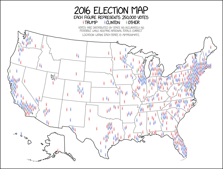
Randall seems to be making a point on the shortcomings of both maps, by showing how different the actual vote was from the red and blue choropleth maps. He mentions how strange cartograms look, and by creating this map he hopes that it will convey the actual vote by geography well, while keeping the normal geographic boundaries.
The title text repeatedly attempts and fails to spell the term choropleth map, a map that uses shading or colors to show information about a geographic area. A choropleth map for elections has many shortcomings. For example, many large Western states have small populations and thus don't make much difference to the electoral vote count, but look like a broad swath of red or blue on the map. The map overall can have the appearance of being very red or very blue, suggesting to the eye an overwhelming victory, when in fact the election may be extremely close. Donald Trump has repeatedly emphasized how red the map appears, especially when broken down by county, even though he actually lost the popular vote. In a speech on June 21, 2017, he said, "And those maps, those electoral maps, they were all red. Beautiful red."
In this cartoon, Randall seems to be pointing out the shortcomings of the choropleth map (or perhaps this overall red-state/blue-state mentality). His map shows more clearly the small impact of the low-population states, as well as how combination of the winner-take-all system with the typical election maps fails to show the sometimes large number of opposition votes in a given state. This map also combines all third-party or independent candidate into one type of marker (green, likely as the third primary additive color available, but at least in part would represent the Green Party), making it clear that a substantial number of votes went to these candidates.
A cartogram, also referenced in the title text, is a map that changes the size, and sometimes shape, of a region based on population or some other metric. Like a choropleth, these maps also have many shortcomings, the most obvious being the distortion required for the maps to work sometimes making it difficult to tell what and where the region actually is. Many versions of cartograms use squares to represent each region, with the size of the square corresponding to the metric measured. Often, it's easier to find specific places on these square maps.
A similar map was actually used during the 2016 election by the Financial Times (discussed here). It made similar use of colorless states for geographic information and color in proportion to population for electoral information. However, the FT map is based on the electoral college, not the popular vote. It in turn is similar to a 2013 map used by The Guardian for the 2013 Australian election (discussed here). Other compromise maps of geographic and electoral information exist, such as maps of geographically accurate but re-scaled states: a 2016 election example is here, indirectly inspired by a similar vox.com map.
With a stick figure representing 250,000 votes, Trump would have exactly 251.918544 stick figures and Clinton would have exactly 263.37844 stick figures according to the final results. The map shows 252 Trump stick figures and 264 Clinton stick figures, meaning Randall used ceiling rounding instead of conventional rounding, which would have shown Clinton with one fewer stick figure.
Table