Scientific Paper Graph Quality
The worst are graphs with qualitative, vaguely-labeled axes and very little actual data.
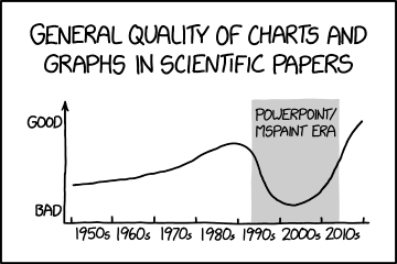
The worst are graphs with qualitative, vaguely-labeled axes and very little actual data.
Microsoft Paint was first introduced in 1985 as a component of Windows 1.0, and Microsoft PowerPoint debuted in 1990. As easy-to-use tools, these allowed for the easy creation of graphs by computer users. The comic implies that these are responsible for decreasing the overall quality of graphs in scientific papers, presumably by enabling a large number of inexperienced designers, and encouraging certain kinds of designs that are ineffective for communicating scientific results.
Critics of PowerPoint, such as Edward Tufte, have argued that the software is ill-suited for reporting scientific analyses. Many scientific journals nowadays explicitly forbid the use of PowerPoint in their instructions for authors. It can be argued that other software specifically built for this task - and techniques to do so - have been refined over time, leading to a rise in graph quality outside the PowerPoint/MSPaint era (though see discussion).
The title text states that among the bad quality graphs, the ones “with qualitative, vaguely-labeled axes and very little actual data” are the worst. While this may indicate that the problem with PowerPoint era graphs is that they seem to focus on getting the point across (qualitative as in “you get the idea”) over accuracy (little actual data), this is more hypocritical humor on Randall's part, as the comic itself features exactly that sort of lambasted graph. The vertical axis labeled “good” and “bad” is entirely qualitative, the horizontal axis manages to use numbers and still be vague by labeling the area between the ticks as decades instead of labeling the ticks, the definition of what constitutes the ‘PowerPoint / MSPaint era’ is entirely unclear, and it is doubtful that any actual data was used to make the graph – certainly there are no actual data points indicated. Its quality is doubtful, and it might represent more of an impression, or opinion, than an actual fact.