Curve-Fitting
Cauchy-Lorentz: "Something alarmingly mathematical is happening, and you should probably pause to Google my name and check what field I originally worked in."
Cauchy-Lorentz: "Something alarmingly mathematical is happening, and you should probably pause to Google my name and check what field I originally worked in."
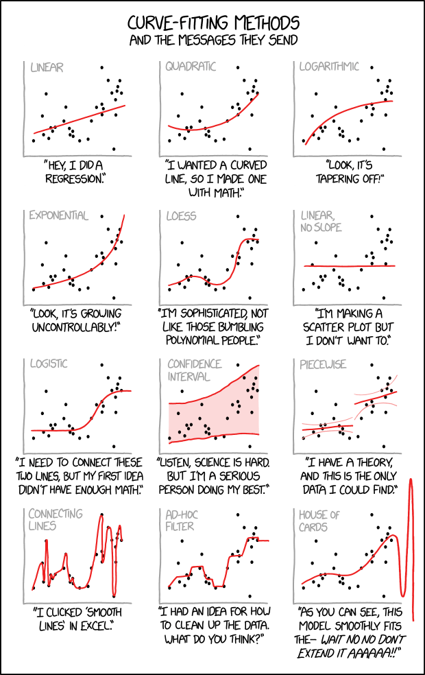
An illustration of several plots of the same data with curves fitted to the points, paired with conclusions that you might draw about the person who made them. These data, when plotted on an X/Y graph, appear to have a general upward trend, but the data is far too noisy, with too few data points, to clearly suggest any specific growth pattern. In such a case, many different mathematical and statistical models could be presented as roughly fitting the data, but none of them fits well enough to compellingly represent the data.
When modeling such a problem statistically, much of the work of a data scientist or statistician is knowing which fitting method is most appropriate for the data in question. Here we see various hypothetical scientists or statisticians each applying their own interpretations to the exact same data, and the comic mocks each of them for their various personal biases or other assorted excuses. In general, the researcher will specify the form of an equation for the line to be drawn, and an algorithm will produce the actual line.
Nonetheless scientists work much more seriously on the reliability of their assumptions by giving a value for the standard deviation represented by the Greek letter sigma σ or the Latin letter s as a measure to quantify the amount of variation of the data points against the presented best fit. If the σ-value isn't good enough an interpretation based on a specific fit wouldn't be accepted by the science community.
Since Randall gives no hint about the nature of the used data set - same in each graph - any fitting presented doesn't make any sense. The graphs could represent a star map, the votes for the latest elected presidents, or your recent invoices on power consumption. This comic just exaggerates various methods on interpreting data, but without the knowledge of the matter in the background nothing makes any sense.
Linear
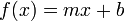
Linear regression is the most basic form of regression; it tries to find the straight line that best approximates the data. As it's the simplest, most widely taught form of regression, and in general differentiable functions are locally well approximated by a straight line, it's usually the first and most trivial attempt of fit.
The picture to the right shows how totally different data sets can result in the same line. It's obvious that some more basics about the nature of the data must be used to understand if this simple line really does make sense.
The comment below the graph "Hey, I did a regression." refers to the fact that this is just the easiest way of fitting data into a curve.
Quadratic
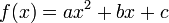
Quadratic fit (i.e. fitting a parabola through the data) is the lowest grade polynomial that can be used to fit data through a curved line; if the data exhibits clearly "curved" behavior (or if the experimenter feels that its growth should be more than linear), a parabola is often the first, easiest, stab at fitting the data.
The comment below the graph "I wanted a curved line, so I made one with math." suggests that a quadratic regression is used when straight lines no longer satisfy the researcher, but they still want to use simple math expression. Quadratic correlations like this are mathematically valid and one of the simplest kind of curve in math, but this curve doesn't appear to satisfy the data any better than does simple, linear regression.
Logarithmic
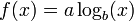
A logarithmic curve grows slower on higher values, but still grows without bound to infinity rather than approaching a horizontal asymptote. The small b in the formula represents the base which is in most cases e, 10, or 2. If the data presumably does approach a horizontal asymptote then this fit isn't an effective method to explain the nature of the data.
The comment below the graph "Look, it's tapering off!" builds up the impression that the data diminishes while under this fit it's still growing to infinity, only much slower than a linear regression does.
Exponential

An exponential curve, on the contrary, is typical of a phenomenon whose growth gets rapidly faster and faster - a common case is a process that generates stuff that contributes to the process itself; think bacteria growth or compound interest.
The logarithmic and exponential interpretations could very easily be fudged or engineered by a researcher with an agenda (such as by taking a misleading subset or even outright lying about the regression), which the comic mocks by juxtaposing them side-by-side on the same set of data.
The comment below the graph "Look, it's growing uncontrollably!" gives an other frivolous statement suggesting something like chaos. Also this even faster growth is well defined and has no asymptote at both axes.
LOESS
A LOESS fit (locally estimated scatterplot smoothing) doesn't use a single formula to fit all the data, but approximates data points locally using different polynomials for each "zone" (weighting data points differently as they get further from it) and patching them together. As it has many more degrees of freedom compared to a single polynomial, it generally "fits better" to any data set, although it is generally impossible to derive any strong, "clean" mathematical correlation from it - it is just a nice smooth line that approximates the data points well, with a good degree of rejection from outliers.
The comment below the graph "I'm sophisticated, not like those bumbling polynomial people." emphasises this more complicated interpretation, but without a simple mathematical description it's not very helpful to find informative interpretations of the underlying data.
Linear, No Slope

Also known as a constant function, since the function takes on the same (constant) value c for all values of x. The value of c can be determined simply by taking the average of the y-values in the data.
Apparently, the person making this line figured out pretty early on that their data analysis was turning into a scatter plot, and wanted to escape their personal stigma of scatter plots by drawing an obviously false regression line on top of it. Alternatively, they were hoping the data would be flat, and are trying to pretend that there's no real trend to the data by drawing a horizontal trend line.
The comment below the graph "I'm making a scatter plot but I don't want to." is probably done by a student who isn't happy with their choice of field of study.
Logistic
The logistic regression is taken when a variable can take binary results such as "0" and "1" or "old" and "young".
The curve provides a smooth, S-shaped transition curve between two flat intervals (like "0" and "1").
The comment below the graph "I need to connect these two lines, but my first idea didn't have enough math." implies the experimenter just wants to find a mathematically-respectable way to link two flat lines.
Confidence Interval
Not a type of curve fitting, but a method of depicting the predictive power of a curve.
Providing a confidence interval over the graph shows the uncertainty of the acquired data, thus acknowledging the uncertain results of the experiment, and showing the will not to "cheat" with "easy" regression curves.
The comment below the graph "Listen, science is hard. But I'm a serious person doing my best." is just an honest statement about this uncertainty.
Piecewise
Mapping different curves to different segments of the data. This is a legitimate strategy, but the different segments should be meaningful, such as if they were pulled from different populations.
This kind of fit would arise naturally in a study based on a regression discontinuity design. For instance, if students who score below a certain cutoff must take remedial classes, the line for outcomes of those below the cutoff would reasonably be separate from the one for outcomes above the cutoff; the distance between the end of the two lines could be considered the effect of the treatment, under certain assumptions. This kind of study design is used to investigate causal theories, where mere correlation in observational data is not enough to prove anything. Thus, the associated text would be appropriate; there is a theory, and data that might prove the theory is hard to find.
One notable time this is used is when a researcher studying housing economics is trying to identify housing submarkets. The assumption is that if two proposed markets are truly different, they will be better described using two different regression functions than if one were to be used.
The additional curved lines visible in the graph are the kind of confidence intervals you'd get from a simple OLS regression if the standard assumptions were valid. In the case of two separate regressions, it would be surprising if all those assumptions (that is, i.i.d. Normal residuals around an underlying perfectly-linear function) were in fact valid for each part, especially if the slopes are not equal.
A classical example in physics are the different theories to explain the black body radiation at the end of the 19th century. The Wien approximation was good for small wavelengths while the Rayleigh–Jeans law worked for the larger scales (large wavelength means low frequency and thus low energy.) But there was a gap in the middle which was filled by the Planck's law in 1900.
The comment below the graph "I have a theory, and this is the only data I could find." is a bit ambiguous because there are many data points ignored. Without an explanation why only a subset of the data is used this isn't a useful interpretation at all. As a matter of fact, with the extra degrees of freedom offered by the piecewise regression, it could indicate that the researcher is trying to fit the data to confirm their theory, rather than building their theory off of the data.
Connecting lines
This is often used to smooth gaps in measurements. A simple example is the weather temperature which is often measured in distinct intervals. When the intervals are high enough it's safe to assume that the temperature didn't change that much between them and connecting the data points by lines doesn't distort the real situation in many cases.
The comment below the graph "I clicked 'Smooth Lines' in Excel." refers to the well known spreadsheet application from Microsoft Office. Like other spreadsheet applications it has the feature to visualize data from a table into a graph by many ways. "Smooth Lines" is a setting meant for use on a line graph, a graph in which one axis represents time; as it simply joins up every point using bezier (or similar) curves as necessary to pass through every point (rather than finding a more sensible line that accepts some minimal but non-zero acceptible level of error in the datapoints), it is not suitable for regression.
Ad-Hoc Filter
Drawing a bunch of different lines by hand, keeping in only the data points perceived as "good". Not really useful except for marketing purposes.
The comment below the graph "I had an idea for how to clean up the data. What do you think?" admits that in fact the data is whitewashed and tightly focused to a result the presenter wants to show.
House of Cards
Not a real method, but a common consequence of misapplication of statistical methods: a curve can be generated that fits the data extremely well, but immediately becomes absurd as soon as one glances outside the training data sample range, and your analysis comes crashing down "like a house of cards". This is a type of overfitting. In other words, the model may do quite well for (approximately) interpolating between values in the sample range, but not extend at all well to extrapolating values outside that range.
Note: Exact polynomial fitting, a fit which gives the unique
th degree polynomial through
points, often display this kind of behaviour.
The comment below the graph "As you can see, this model smoothly fits the- wait no no don't extend it AAAAAA!!" refers to a curve which fits the data points relatively well within the graph's boundaries, but beyond those bounds fails to match at all.
Cauchy-Lorentz (title text)
Cauchy-Lorentz is a continuous probability distribution which does not have an expected value or a defined variance. This means that the law of large numbers does not hold and that estimating e.g. the sample mean will diverge (be all over the place) the more data points you have. Hence very troublesome (mathematically alarming).
Since so many different models can fit this data set at first glance, Randall may be making a point about how if a data set is sufficiently messy, you can read any trend you want into it, and the trend that is chosen may say more about the researcher than about the data. This is a similar sentiment to 1725: Linear Regression, which also pokes fun at dubious trend lines on scatterplots.
A brief Google search reveals that Augustin-Louis Cauchy originally worked as a junior engineer in a managerial position. Upon his acceptance to the Académie des Sciences in March 1816, many of his peers expressed outrage. Despite his early work in "mere" engineering, Cauchy is widely regarded as one of the founding influences in the rigorous study of calculus & accompanying proofs. Notably, his later work included theoretical physics, and Lorentz was also a well-known physicist. Therefore, the title-text may be referring back to 793: Physicists.
Alternately, the title-text could be implying that the person who applied the Cauchy-Lorentz curve-fitting method may not be well qualified to the task assigned.


