Cursive Letters
𝓘 𝓽𝓱𝓲𝓷𝓴 𝓬𝓪𝓹𝓲𝓽𝓪𝓵 𝓛 𝓲𝓼 𝓹𝓻𝓸𝓫𝓪𝓫𝓵𝔂 𝓽𝓱𝓮 𝓶𝓸𝓼𝓽 𝓯𝓾𝓷 𝓽𝓸 𝔀𝓻𝓲𝓽𝓮, 𝓽𝓱𝓸𝓾𝓰𝓱 𝓵𝓸𝔀𝓮𝓻𝓬𝓪𝓼𝓮 𝓺 𝓲𝓼 𝓪𝓵𝓼𝓸 𝓪 𝓼𝓽𝓻𝓸𝓷𝓰 𝓬𝓸𝓷𝓽𝓮𝓷𝓭𝓮𝓻.
𝓘 𝓽𝓱𝓲𝓷𝓴 𝓬𝓪𝓹𝓲𝓽𝓪𝓵 𝓛 𝓲𝓼 𝓹𝓻𝓸𝓫𝓪𝓫𝓵𝔂 𝓽𝓱𝓮 𝓶𝓸𝓼𝓽 𝓯𝓾𝓷 𝓽𝓸 𝔀𝓻𝓲𝓽𝓮, 𝓽𝓱𝓸𝓾𝓰𝓱 𝓵𝓸𝔀𝓮𝓻𝓬𝓪𝓼𝓮 𝓺 𝓲𝓼 𝓪𝓵𝓼𝓸 𝓪 𝓼𝓽𝓻𝓸𝓷𝓰 𝓬𝓸𝓷𝓽𝓮𝓷𝓭𝓮𝓻.
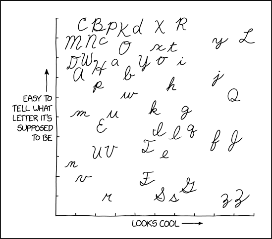
This graph ranks cursive Latin script letters. The type of cursive used is closest to D'Nealian though a few of the letters appear to be in the Zaner-Bloser style of cursive (specifically the P, Q, and p). The graph uses two criteria: legibility and coolness. According to the graph in the comic: 'L' is in the top-right quadrant indicating it is both cool and easy to read; 'C' is in the top-left, meaning it is easy to read, yet not cool; 'Z' and 'z' are in the bottom-right which means cool looking, yet not easy to read; and 'r' which is bottom-left indicating it is neither particularly cool nor very easy to read (perhaps being confusable as a form of 'n', or even 'M', at least until actual cursive versions of those are comparable against).
The purpose of cursive is to allow efficient handwriting and make characters look nice and more "connected" at the same time. This is a particular issue when writing with a quill or fountain pen which tends to make noticeable marks when lifting the pen, so joined letters are generally neater than separated ones. The possible downside of this is the legibility of the individual letters. This may be due to the similarity of cursive letter shapes (e.g. 'U' and 'V' or 'e' and 'l' in the graph), especially when joined to other letters, or due their dissimilarity from more familiar "block letter" counterparts (e.g. 'Z' and 'z' in the lower right corner).
In the title text, Randall states 'L' and 'q' are letters that he enjoys writing in cursive, which could possibly add a third axis (most fun to least fun) to the graph. Notably, some RSS apps have challenges displaying the font and result in settings of '???'s.
The title text is written in cursive-looking font using upper unicode characters (encoded as UTF-8). Example: the cursive 'I' character 𝓘 (Unicode 120024 U+1D4D8) is F0 9D 93 98 in UTF-8. The title text includes 22 of 26 characters in the English lowercase alphabet and is thus 4 characters short of a pangram (missing letters: j, v, x and z). Pangrams are often used to show all the characters in a typeface in print or on a computer screen. It is unclear if the comic deliberately chose the words in the title text to show almost all the characters in cursive or if it is simply a coincidence.
To benefit those with lacking Unicode support, the title text reads: "I think capital L is probably the most fun to write, though lowercase q is also a strong contender."