Skew-T Log-P
The most important quantity for meteorologists is of course the product of latent pressure and temperostrophic enthalpy, though 'how nice the weather is' is a close second.
The most important quantity for meteorologists is of course the product of latent pressure and temperostrophic enthalpy, though 'how nice the weather is' is a close second.
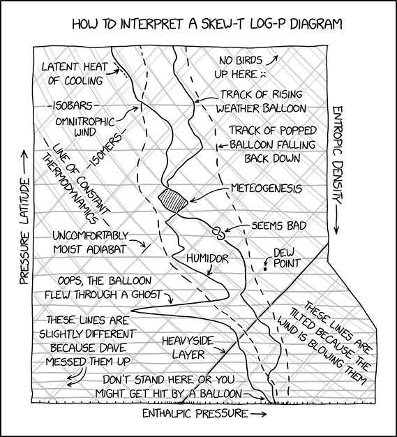
Skew-T log-P diagrams are commonly used to plot atmospheric soundings collected by weather balloons or other methods. The name comes from the temperature (T) lines being skewed at a 45-degree angle and the pressure (P) lines being logarithmic in scale. Although it looks very much like a cross-sectional diagram, it shows non-positional information derived from passing (generally) vertically up through the atmosphere from the initial reference location.
Because the diagrams have a lot of lines on them (isobars, isotherms, adiabats, and mixing ratios, and that's before plotting the actual measurements of temperature and dew point temperature), they can be hard to comprehend. The comic pretends to offer an explanation of one such diagram, but most of the explanations are blatantly incorrect or humorous in nature. The diagram appears to have either measurements from two separate weather measurements or the measured temperature and dewpoint from a single balloon, with solid lines for the primary balloon's two streams of data (often disambiguated by the chosen hue of the line) and dashed ones for the secondary set of data (popped balloon(s) falling back down, a separate second survey balloon rising or estimates derived from weather-radar data). See details in the table below. Many weather balloons are designed to rupture after reaching a certain height high in the atmosphere.
The true design of a Skew-T Log-P diagram is intended to best represent the nature of the weather in any given column of atmosphere. The pressure (vertical axis, with pressure being inversely related to altitude, more or less) is shown as a logarithmic scale (i.e., Log-P) because it makes altitudes nearly evenly spaced. Plotting pressure proportionately (which must also be from top to bottom, to match its general relationship with altitude) would space features out in ways that would be hard to use and interpret, whereas the logarithmic scale is far more pragmatic. The temperature scale is deliberately tilted, rather than orthogonal, which (together with the logarithmic nature of the inverted pressure scale) allows the typical way that temperatures fall with altitude(≈as pressure falls) to trend roughly vertically, give or take the notable changes that are key to understanding the forecast. Other measurement lines, differently skewed and often also curving across the temperature/pressure skewed-log 'grid', represent various other idealistic relationships (where both T and P vary, keeping another measure constant) that are useful references to meteorologists.Upon this style of graph are plotted the actual measurements obtained by releasing a weather balloon or through some other sensor. As well as the variation of actual temperatures and pressures, other retrieved and calculated data is plotted, such as the dew point. The dew point, a function of the air's water content, temperature, and pressure, is where condensation begins. By observing how the actual measurements and dew point line converge and cross, the development and nature of clouds can be tracked and pinned to specific cloud layers. Further details may also be included, such as wind-direction and wind-speed indications (often to the side of the plot) to give a visual cue about possible wind shear and/or to suggest which direction of adjacent weather-station readings may hold clues as to what changes may later blow in above the current site.
In the title text it is stated that "The most important quantity for meteorologists is of course the product of latent pressure and temperostrophic enthalpy, though 'how nice the weather is' is a close second". So it jokes by comparing a non-existent, complicated-sounding product (temperostrophic enthalpy is not actually a thing) with a simple sentence about how nice the weather is.
