Fix This Sign
We're building on our earlier success getting web developers to pay to change the backslashes in our displayed payment URL to forward slashes.
We're building on our earlier success getting web developers to pay to change the backslashes in our displayed payment URL to forward slashes.
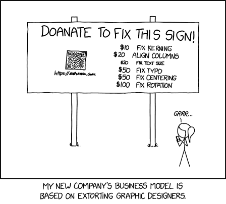
Randall has created a sign with a number of issues, such as bad kerning and alignment, that graphic designers might be disturbed by. Fortunately these graphic designers can donate money to have the sign's issues fixed (which is possibly an improvement upon the situation invoked in the case of 2598: Graphic Designers). Ironically, once all the errors are fixed, the sign won't make sense any more, requesting money for fixes that have already been made.
The relative values assigned to each 'fix' are presumably proportional to at least one observer's perceived degree of issue with each 'mistake'. Given the costs of printing a sign of this size, Randall may have severely underpriced his fixes and set up his business to fail, if he intends to honour the pledges. He may be relying on there being a lot of passing graphic designers, generating multiple 'doanations' for each issue. Perhaps he will only fix them if a certain total amount of money is raised. This would be similar to the Kickstarter model, where people can donate at different levels and multiple people can donate at the same level, but the project will only be undertaken if a certain total amount of money is raised. If that total is not raised, nobody gets charged and the project is cancelled. One would hope the QR code would lead to a page detailing whether that's the case, what the total amount raised would need to be to be worth undertaking the fixes, or otherwise explaining how the
scamproject works. The following paid solutions to deliberate issues are advertised:
- Fix kerning ($10)
- Kerning refers to the spacing between letters in a typeface, previously addressed in 1015: Kerning. Kerning issues can result in letters in text appearing too far apart, as if there were a space in between, or too close, as if the letters were merged. In some instances, combinations of letters can appear like other letters. A well known example of this is the r and n merging into an m. (For example, "kerning" might appear as "keming", which is hinted at in the comic with the R and N close together, although here they are in uppercase, so this merging doesn't happen.)
- In this instance, the N and I in this word are very close together in this actual item, as a self-demonstrating issue. In the sign's title, the I and S (in "THIS") are too far apart and the S and the I (in "SIGN") are too close to each other.
- Align columns ($20)
- Here the dollar amount and the text itself do not align in columns with the other entries, which disrupts the flow of the eye down the list, making it harder to read.
- Fix text size ($20)
- The size of this entry is smaller than the rest of the other entries. As with the misaligned columns, such variances could be displeasing to the eye or distracting.
- Fix typo ($50)
- The title of the sign says "Doanate to fix this sign!" Someone who is easily annoyed by random typos could be compelled to donate just to get the typo fixed.
- Fix centering ($50)
- The content of the sign is off-center, leaving larger gaps to the left than to the right.
- Fix rotation ($100)
- The content of the sign slopes slightly down from left to right. For example, in the title "doanate" is higher than "sign", and the QR code 'graphic' is noticeably off-square.
- Title text
- The title text refers to another common annoyance in a different field: that of website developers and, specifically, weblinks. URLs are defined to use forward slashes (/) rather than backslashes (\), which are used in Windows pathnames. Due to the widespread usage of both URLs and Windows pathnames, it is not uncommon for someone to mistakenly use backslashes in URLs, which isn't always supported. This annoyance was also discussed in 727: Trade Expert.